 |
Whitney with Gotham Narrow |
Annual reports, financial disclosures, investor presentations... When you're faced with designing text-heavy, number-heavy material, few things make the job easier than choosing the right fonts. This month, H&FJ presents four things to look for when selecting a typographic palette, and five families of fonts that are designed to meet the challenge. |
 |
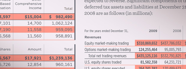 |
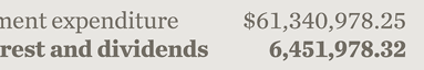
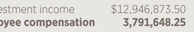
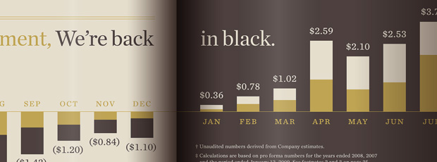
The numbers in a font can reveal where the design will work best. For setting text, look for a font with variable-width "proportional" figures; for aligning columns of numbers, choose a font with "tabular" figures. For annual reports, make sure your font has both: these five families from H&FJ do. |
|
"Weight Duplexing" — In our font families that include tabular figures, we use the same fixed width throughout the entire range of weights, so designers can use boldface to highlight a single line without disrupting the underlying grid. |
|
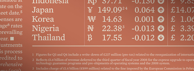
Condensed Tabulars — Even a well-designed table can collapse under the burden of a nine-digit number. For tables that feature narrow columns, long numbers, or both, try our newly-expanded Gotham family, which includes tabular figures in four different widths. |
|
||
 |
||
 |
||
 |
||
 |
||
 |
 |
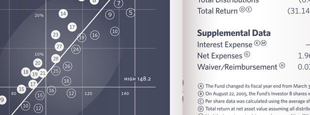 |
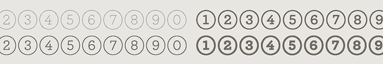
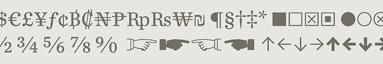
Numbers in circles are called indices, and they're indispensable when numbering key concepts in an overview, plotting data points on a graph, or highlighting features of a chart. To help with the most demanding situations, try our Whitney Index package, which includes indices in sixteen different forms. |
|
Multiple Enclosures — Whitney's indices come in both circles and squares, and in both positive and negative versions, allowing readers to distinguish different data lines — even when designers are limited to a single color. |
|
Double-Digit Indices — Whitney Index includes double digits for when the CEO's ten-point plan runs to eleven points (or 99, for that matter.) Also included is a full alphabet, because sometimes there's no better way to symbolize "third quarter" than an iconic "Q3." |
|
Indices as Reference Marks — Instead of running out of punctuation after the asterisk, dagger, and double-dagger, try using indices to indicate footnotes. They're neater, more intuitive, and easier to use in combination with one another. |
|
||
 |
||
 |
 |
 |
Sometimes it's necessary to fine-tune the 'color' of a font without changing its overall shape. Graded fonts are those provided in progressively more robust variations, which give designers precise control over the effects of ink on paper — and all without affecting copyfit. |
|
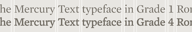
Reversing Out — Dropping type out of a solid color means reinforcing the type, but the jump from one weight of a type family to the next is often too noticeable. Choose a graded family, in which the crisper Grade 1 can be used for text, and the brawnier Grade 4 for knockouts. |
|
Stock Changes — If you're working with different papers in an annual report, choosing different grades of the same font can help keep the type's color looking consistent, even if you're using a high gloss sheet for the narrative section and an uncoated sheet for the financials. |
|
||
 |
||
 |
 |
 |
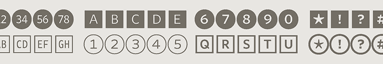
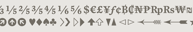
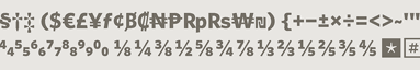
Numbers have a way of requiring special symbols that can sometimes be hard to come by. These four type families from H&FJ feature an assortment of esoteric glyphs that range from merely helpful to completely essential. Which ones will you need? |
|
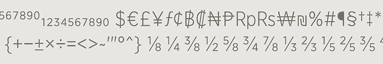
Extended Monetary — For projects that extend beyond dollars, pounds, Euros and yen, look for a typeface that includes an extended set of currency symbols. These font families from H&FJ include more than three times the typical number of symbols, for currencies as common as the Rupee and as rare as the Sheqel. |
|
Footnotes — Frequently unavoidable, and hard to fake; anything with the word "disclosure" will have footnotes. Make sure your font has them. |
|
Pi — Both our Chronicle Text and Mercury Text families include a set of 74 dingbats, from trend arrows to ballot boxes to pointing fists. |
|
||
 |
||
 |
||
 |
||
 |
| You're receiving this e-mail either because you're a customer of H&FJ, or because you've created an account on our website, www.typography.com. We don't e-mail often, but if you'd rather not hear from us at all, you can simply click here to unsubscribe the address *|EMAIL|* from our list. Copyright © 2009 Hoefler & Frere-Jones. 611 Broadway, New York, NY 10012-2608. Archer, Chronicle, Gotham, H&FJ, Mercury, Sentinel, and Whitney are trademarks of H&FJ, which may be registered in certain jurisdictions. Prices are subject to change without notice. All rights reserved. |