View in a browser
  Hoefler&Co

Exploring Typography

Recent discoveries, observations, and thoughts
by Jonathan Hoefler, Hoefler&Co.

Hoefler&Co

Today, we’re publishing a new family of typefaces called Inkwell Condensed. These six new styles are part of the Inkwell universe of ‘handwritten typefaces,’ designed to have the informality and expressiveness of writing, but the credibility and ease of type. We’re rolling them into the Inkwell Complete package, so they’ll be a free download for existing licensees of those fonts, and available to purchase individually if you’re new to Inkwell.

But first, an observation about size and shape that has me wondering if everything I’ve ever learned about optical size is wrong.

The new Inkwell Condensed.
 

A typeface’s optical size is the scale at which it’s intended to be used. When a display face is redesigned for smaller sizes, its thin strokes are thickened, its gestures are amplified, its proportions are adjusted to favor small shapes (the entire lowercase usually gets substantially bigger), and additional white space is added wherever it can help relieve congestion: counters are enlarged, apertures opened, and inter-character fit is loosened. The net effect of these changes is an overall widening of letterforms as they get smaller, as a quick comparison of related text and display faces will confirm. Our tidy conclusion is that at small sizes, wider letters are easier to read.

And while this is demonstrably true, it conceals a cunning logical fallacy. We can’t prove its reverse statement (its ‘contrapositive’), that at large sizes, narrower letters are easier to read, and wider ones harder. This is observably not true, so something’s up.

Chronicle Display and Text
Ringside Narrow and Screensmart
 

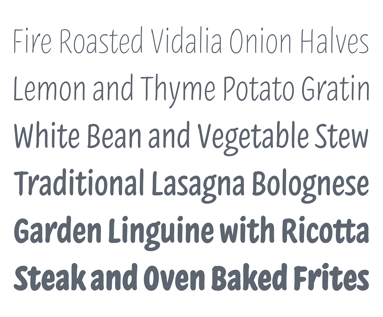
When Jordan Bell and I first began drawing Inkwell Condensed, we had a hard time keeping the design from looking too slick. Inkwell is a collection of informal, unmannered designs, expressly designed to reveal the presence of an author behind the words. Yet our earliest drawings for the Condensed were almost instinctively polished, like the lettering of signs in supermarket windows (whose bouncy nonchalance belies the practiced hand of a master signpainter.) Somehow the other Inkwells had succeeded in feeling less like the work of a commercial artist, and more like the patient block lettering of a competent and determined doodler. But the Condensed was going its own way.

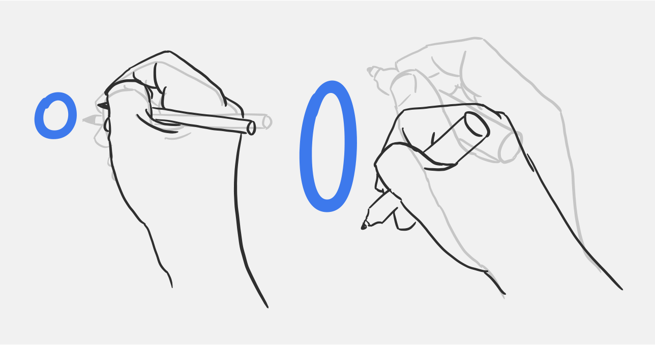
What neither of us noticed was that we’d been drawing at a larger size than usual, where it was easier to control the design’s steep angles and compact curves — and this is where size, proportion, and style begin to connect. The other Inkwells had been drawn at handwriting size, where the fingertips can comfortably guide a pen in circular motions. But these new drawings came from the wrist, which is given to large, fluid curves — and, because its functional range of motion is twice as vertical as horizontal, it draws shapes that are taller than they are wide. Our wrists are more flexible with up-and-down extension and flexion than with side-to-side ulnar and radial deviation. Try it: with a stiff arm and loose wrist, draw wide circles in the air with your index finger, and notice how much easier it is once you compress the circle into an upright ellipse. This fact of our physiology may be part of our comfort and familiarity with condensed letterforms at display sizes: it’s not that they’re easier to read, but that at large sizes, narrower letters are easier to write.

 
The new Inkwell Condensed.
 

If Inkwell Condensed has the same optical size as the other members of the Inkwell family, it might be said to have a larger carpal size, feeling most natural when it’s taller than the handwriting-like typography it accompanies. We’ve worked to ensure that it has the same candor and lack of pretense as the rest of the Inkwell family, and feels like the product of the same capable but unstudied hand. Because we’re used to seeing tall writing in public, Inkwell Condensed ably handles the kinds of lettering that once went only to signpainters: price lists, placards, covers and posters seem to be its métier.

With the hope that Inkwell fans will want to use the fonts immediately, I’ve decided to make it a free download for anyone who’s already bought Inkwell Complete. If you’re new to Inkwell, you can pick up the six-style Inkwell Condensed for $129, or the fifty-four style Inkwell Complete for $399. I hope they’ll make a valuable addition to your collection!

Jonathan Hoefler
13 February 2019

 
The new Inkwell Condensed.
 

Typefaces Mentioned

Inkwell Condensed

Inkwell Condensed

 
Chronicle Display

Chronicle Display

 
Ringside Narrow

Ringside Narrow


Thanks for taking an interest in the work we do at Hoefler&Co — I appreciate the opportunity to communicate with anyone who shares our love of typography. You’ve received this email because our records show that you signed up for our mailing list at typography.com: you can unsubscribe if you’re no longer interested, or resubscribe if you change your mind. As described in our privacy policy, H&Co does not buy, sell, exchange, or rent email addresses. Copyright © 2019 Hoefler&Co, 611 Broadway, New York, NY 10012-2608. The names of the H&Co typefaces featured herein are trademarks of H&Co, which may be registered in certain jurisdictions. All rights reserved.

Recently from H&Co: Turning Type Sideways