| |

Exploring Typography
Recent discoveries, observations, and thoughts
by Jonathan Hoefler, Hoefler&Co.
|
|
|
Q: If you’re using a style named ‘extra light,’ which weight do you select for emphasis?
The answer’s contained in a simple rule that governs all H&Co typefaces. But it’s a rule we’ve somehow never thought to share, leaving even the most astute designers to grope through a fog of Mediums and Semibolds in search of a solution. Starting this month, we’re changing all that: on today’s typography.com, you’ll find 46,987 words devoted to How to Use every typeface in our library.
|
|
|
| |
These are the things we’ve learned in our years of both designing typefaces and working with them. The new How to Use pages illustrate all the undocumented features in our library of more than 1,500 fonts, and explain the built-in behaviors that make the fonts perform the way they do. But most of all, they begin the project of recording our institutional memory, illustrating the subtle ways in which the typefaces express their designers’ intentions, and chronicling the many inside tips that our visual designers and developers have devised along the way.
How to Use will be an ongoing project, a place to continue to collect the things we learn, the things we remember, and all the things we discover about using type. Here’s a taste of what’s in store…
Meeting the Family
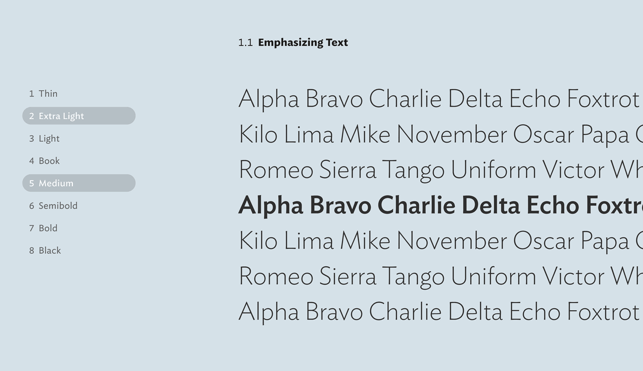
We always say that a type family should have “as few styles as possible, but as many as necessary,” yet somehow their numbers always manage to grow. To wrangle the matrix of weights, widths, postures, and optical sizes included in our fonts, we’ve created for every family a feature called Pairing Styles that explores how different familial relationships are specifically designed to provide emphasis, distinction, or decoration. The feature for exploring weights illustrates something we’ve never thought to mention: that in H&Co font families, the intervals between weights are chosen to work in parallel, so that any pair of styles separated by the same number of steps will have the same degree of contrast. The interactive version explains it best:
|
|
|
|
| |
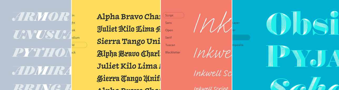
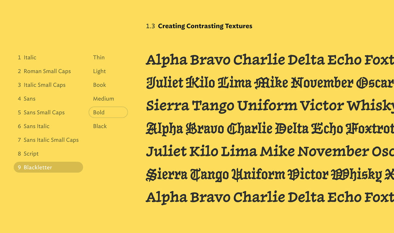
For our many families whose members have more unorthodox relationships, such as Inkwell and Landmark, we’ve created miniature laboratories to explore some of the style pairings that we’ve found most effective in Creating Contrasting Textures. These neither prescribe what you must do, nor illustrate everything you can do, but they’re a quick way to cut down a long list of permutations to the ones with which we’ve had the most success:
|
|
|
|
| |
Techniques
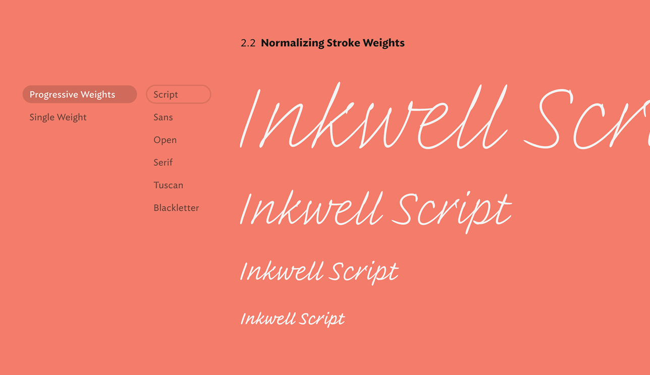
We created How to Use not simply to document what’s inside a typeface, but to illustrate some of the less obvious things that are made possible by different designs. A typeface like Inkwell, for example, invites compositions in which large and small letters appear to have been made with the same pen, an effect that’s easily achieved once you figure out a comfortable relationship between point size and stroke weight. In a feature called Normalizing Stroke Weights, you’ll find our formulas for creating this effect, freed from the Post-It Notes where they used to live:
|
|
|
|
| |
You’ll find tips for effecting similar techniques throughout our library, whether you’re using the delicate hairlines of Archer or the even-tempered strokes of Gotham. A related feature explores the Optical Sizes in fonts that are sensitive to the effects of scale, such as the hairline serifs of Chronicle and Requiem.
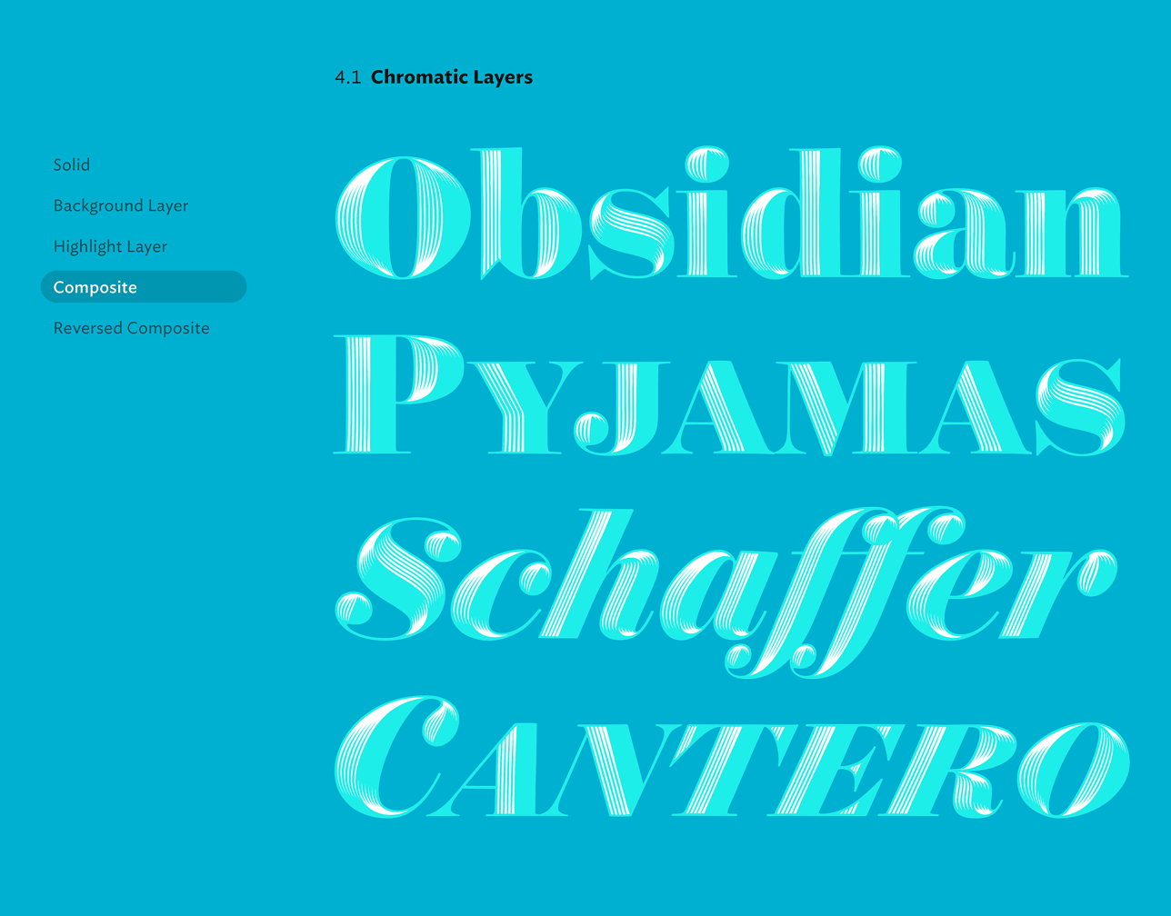
For fonts with chromatic layers, such as Obsidian, Peristyle Stencil, and our Shades collection, a feature called Working with Color demonstrates different configurations of foreground and background layers. Their illustrations cover solutions to some of the more common challenges of two-color typography, such as overlapping letters in a ligature, or the clustering of letters of a single color:
|
|
|
|
| |
Automation
Since so much of what happens in a typeface goes on behind the scenes, we’ve illustrated and explained how a font’s Automated Features work — and described situations in which typography can be improved by overriding a font’s natural behavior:
|
|
|
|
| |
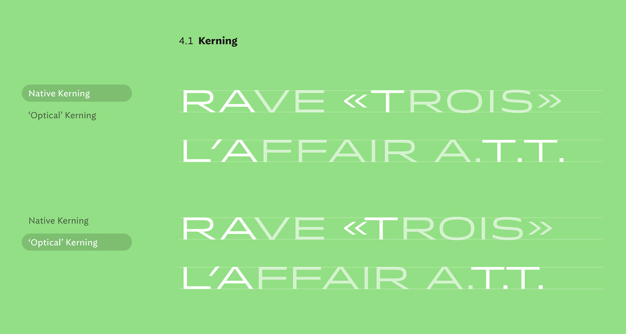
In the sections that eliminating collisions and achieving consistent spacing, you’ll find more than forty different examples of why you should never ever use so-called ‘optical kerning’, especially in script faces, most especially in chromatic faces, but moreoever anywhere that you care what letters look like. Share these with your colleagues, your freelancers, your interns, your boss, and most of all, your clients. Mention this in your brand identity styleguides: it’s an easy way to protect against the kind of mischief that destroys logos.
|
|
|
|
| |
Customization
A feature called Using Special Characters contains organized lists of all the characters unique to each typeface, including descriptions of what they’re for, and how they’re most easily activated:
|
|
|
|
| |
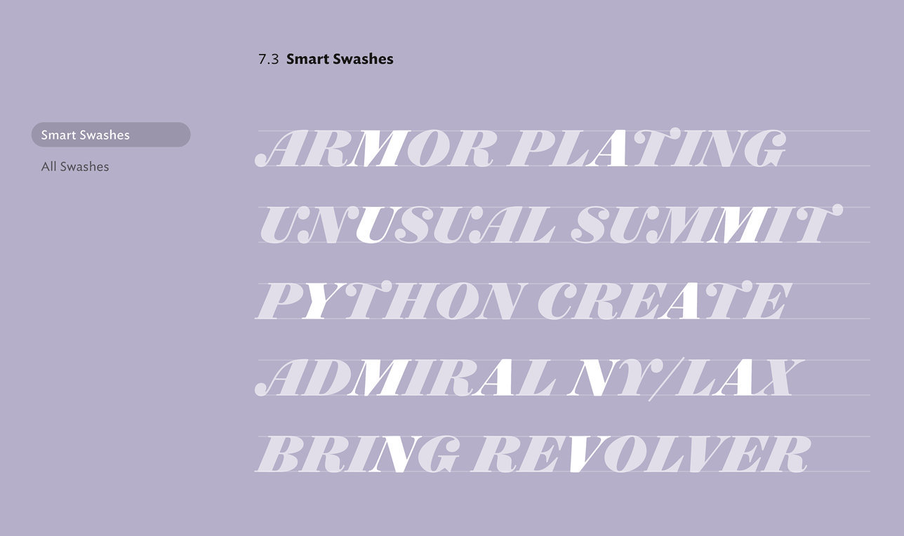
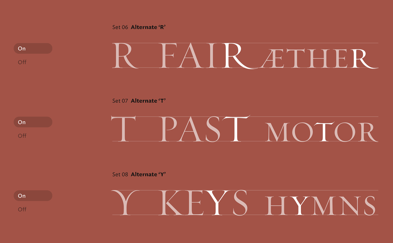
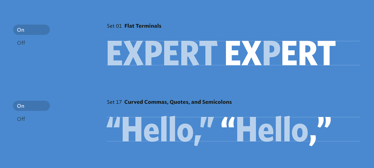
In addition to the tour of special characters you’ll find in collections such as Numbers and Hoefler Text, each font’s How to Use section includes full documentation for its Stylistic Sets, which allow related substitutions to be activated with a single control — still the best, easiest, and most powerful way to change the temperament of a typeface:
|
|
|
|
| |
Once you’ve taken a tour of How to Use, pop over to our redesigned Overview pages, where you can try all of these techniques for yourself, right here in the browser. As always, I look forward to seeing how our work can play a part in yours!
Jonathan Hoefler
21 May 2019
|
|
| |
Typefaces Mentioned
|
|
Recently from H&Co: A new typeface. And a new observation.
|
|
|