
It’s rare that any two fonts from H&Co share the same character set. Some special characters are designed to provide additional functionality, others are there to heighten the unique flavor of the typeface. Still others are included as alternates, to help a single typeface speak in multiple voices, a hallmark of H&Co’s designs. Let me introduce you to some of my favorite family eccentrics. I promise, they’ll grow on you. —JH
|

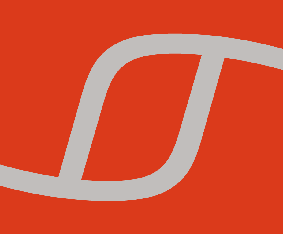
Sagittarius contains a set of ligatures that connect characters with hairline crossbars, such as the T, f, g, r, t, and z. This r-t-f ligature is substituted automatically when needed, in words such as ‘artful.’

Decimal features a collection of symbols for UI design, including this binary switch in the ‘off’ position.
Trafalgar, from our Numbers collection, contains a set of British currency indicators, including the modern ‘p’ (for pence) and the pre-decimalization ‘d’ that also indicated pence, but took its name from ‘denarius,’ the Latin word for penny.

Sentinel Ornaments contains two fonts, Bright and Dark, both of which make heavy use of asterisks and other stellar ornaments.
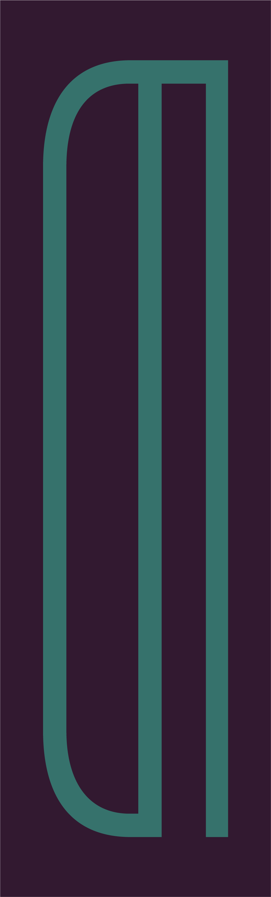
Operator, like all H&Co fonts, includes coverage for 503 languages including Polish. This L-slash (Ł) in Operator’s bold italic follows the cursive construction, in which the intersecting slash appears as a swash above the letterform.

The decorative Peristyle Stencil typeface offered irresistible moments to apply the stencil’s ‘bridges’ in entertaining ways. Here, a number sign (#) appears as it might have been constructed in a die-cut stencil.
Adjacent horizontal strokes, in letters like f and t, are managed by complex automated features inside the Inkwell Script typeface. This oddity is the form of lowercase T that’s accompanied by a caron accent, designed to appear when followed by an f or t.
In Welsh, the W can be accompanied by a two-dotted dieresis, which invited a little mischief in the inline Cesium typeface, where all letters are physically joined to their accompanying accents.

An extract from the Bright style of Sentinel Ornaments, which contains 250 ornaments designed to lock together to form decorative patterns and dashes.

While rendered here in the style of Sentinel Black, this to the best of my knowledge is not actually a letter, and is therefore not to be found in Sentinel or any other H&Co typeface.
The Revenue font, from our Numbers collection, is based on the markings made by cash registers and adding machines. It therefore includes the set of abbreviations rendered as single units, such as CG for ‘change,’ TL for ‘total,’ and this self-explanatory mark.
An accent unique to the Maltese language is the barred H, included in all fonts from H&Co, never more colorfully than here in the Landmark Shadow typeface.

A recent addition to the character set is the Capital Eszett, finally answering the question of how the German ‘ß’ should be rendered when setting all caps. This one comes from the recently-updated Sentinel family, which now includes not only lowercase and capital eszetts, but one for small caps as well.

The two fonts of ornaments in our Sentinel Pro family have forms that echo the typefaces’s analphabetic forms. These endpieces for ornamental dashes are recognizable cousins of the family’s lobed asterisks.

The superitalic Nitro takes every opportunity to reinforce the font’s velocity and forward momentum. This paragraph mark adds an interior angle that leans even more aggressively forward, even beyond the font’s 26° angle of incline.

Two symbols for engineering, the ohm and micron, are included in all twelve weights of the Sentinel Pro family — as well as the high-performance Sentinel ScreenSmart Pro that’s designed and engineered for web browsers.

In the functionalist Isotope typeface, the symbol for pounds sterling (£) features all of the design’s signature moves: soft shoulders, sharp corners, and arms that are square to the body.

The key icon in the Decimal typeface is drawn in each of the family’s ten weights, as part of a complete kit of parts for UI designers.

The lightly-worn retrofuturism of our Sagittarius typeface can be amplified by including the stylized Magnetic Ink Character Recognition delimiters that are included in the font. Some are authentically taken from the specifications used to mark bank checks; others, like this one, are ornamental inventions.

Since an iconic moment in the Isotope typeface is the shape of its letter S, the design of its section mark (§) gave us a chance to double down on the font’s zagging geometry.
For one of its many irresistible excursions into science fiction, the Sagittarius typeface includes a set of stylized barcodes based on an established but rare symbology, the Codabar standard ANSI/AIM BC3-1995. #trivia #barbets #nerdcore #themoreyouknow
|
|

Printers once used the colorful term ‘nut fractions’ to denote vertically stacked numerators and denominators that fit into an en-space. (Compare the em-width ‘mutton fraction.’) This ⅝ symbol comes from Claimcheck, a typeface in our Numbers collection that’s inspired by the humble markings on ticket stubs.
As a security measure, bank checks once used forgery-proof numbers, perforated directly into the paper by ‘check cutting machines.’ The Dividend typeface, from our Numbers collection, is based on these very digits, for which we created a matching set of symbols and punctuation including this ‘vertical bar’ character.

The St. Augustin Civilité, from our Historical Allsorts collection, records a fiery sixteenth century court hand rendered into type by Robert Granjon. Included are a wealth of ligatures and alternates, including this Dutch curio, representing the letters z-i-j.

In each of its ten weights, the symbols in our Decimal family include three kinds of flag: a rectangular ‘standard,’ a triangular ‘pennant,’ and this swallow-tailed ‘guidon.’

Of the three decorative styles that adorn the Landmark family, it’s Landmark Dimensional that took the greatest sleight-of-hand. Here, a closing quote mark plays subtle tricks with the direction of its shadow, in order to sidestep awkward intersections.

One of the most recent additions to the family of currency symbols is the Rupee, standard in all H&Co fonts since Ringside. Even stylized display faces include this symbol, such as this Black weight of the Peristyle family.
One of our favorite curios is the section mark (§), furnished in all of our typefaces. This especially cyclonic one appears in the Book weight of Idlewild, a typeface whose extreme width makes it unexpectedly practical in small sizes.
‘Pilcrow’ is a fifty-cent word for the paragraph mark (¶), that backwards-P glyph that’s actually a stylized backwards C (for capitulum, the Latin word for ‘chapter.’) This one comes from our narrowest typeface to date, the Light weight of Tungsten Compressed.
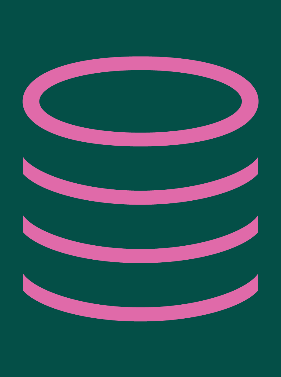
For information graphics that need to indicate orders of magnitude, the Decimal typeface includes single-, double-, and triple-stacked circles and squares, across each of its ten weights.
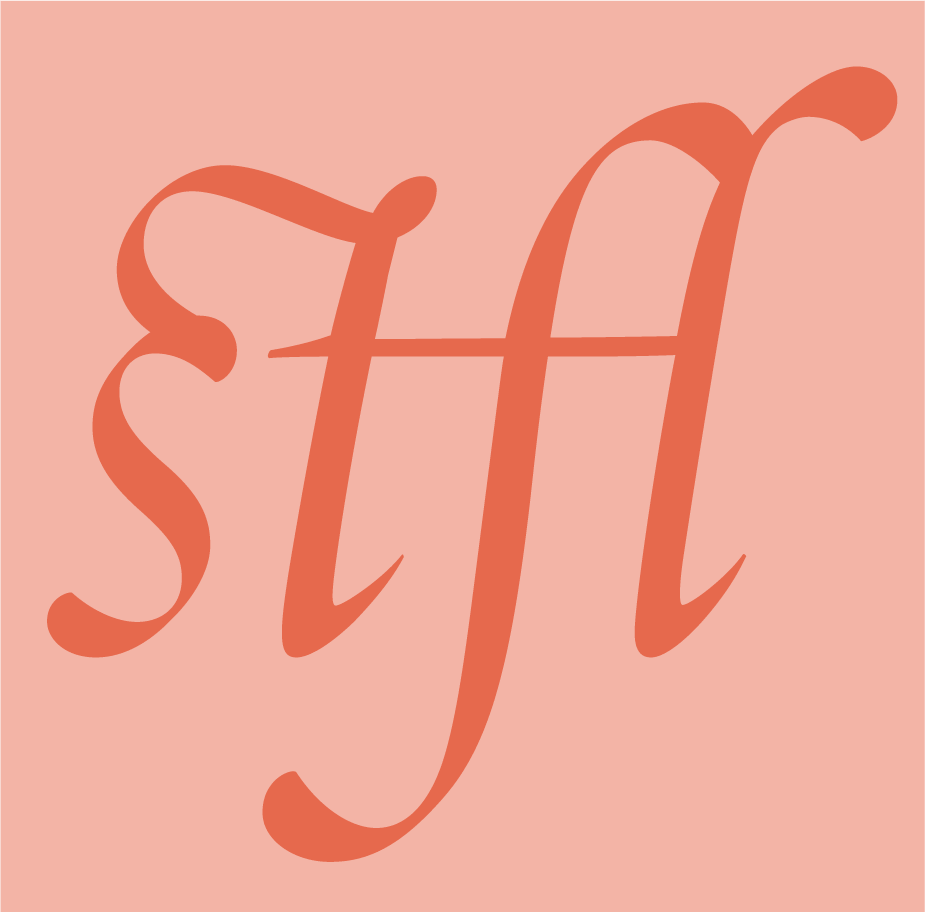
When our Requiem Italic typeface expanded to include not only functional ligatures like f-l, but decorative ones like s-t and t-f, it was inevitable that the set would begin to grow. This s-t-f-l ligature is one of the more baroque agglutinations in the character set; see also stfj and ttfr, and try to guess what words contain them.
The Inkwell Blackletter typeface explores how the textura style might be casually rendered with a felt-tip marker. We took the opportunity to gothicize a number of characters alien to the blackletter style, like this Πdiphthong.

What palaeographers call the ‘double obelisk’ or ‘diesis’ or is known to mortals as the double dagger (‡), a second-order reference mark after the * and † have done their best. For Cesium, our new inline slab serif, we couldn’t resist extending the decorative motif to even the most obscure characters, this one included.
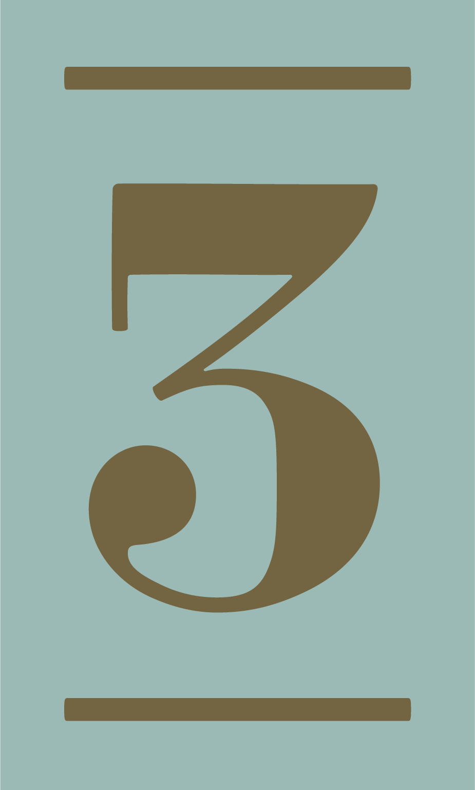
Inspired by enamel house numbers, the Strasse typeface from our Numbers collection includes a feature for capturing numbers, like this three, inside ‘cartouches’ of eight different shapes.

Among the recent expansions of our Sentinel family are two sets of ‘manicules’ (better known as ‘fists’), whose formal ruffed cuffs follow the eighteenth century style that was preserved in nineteenth century printing types.
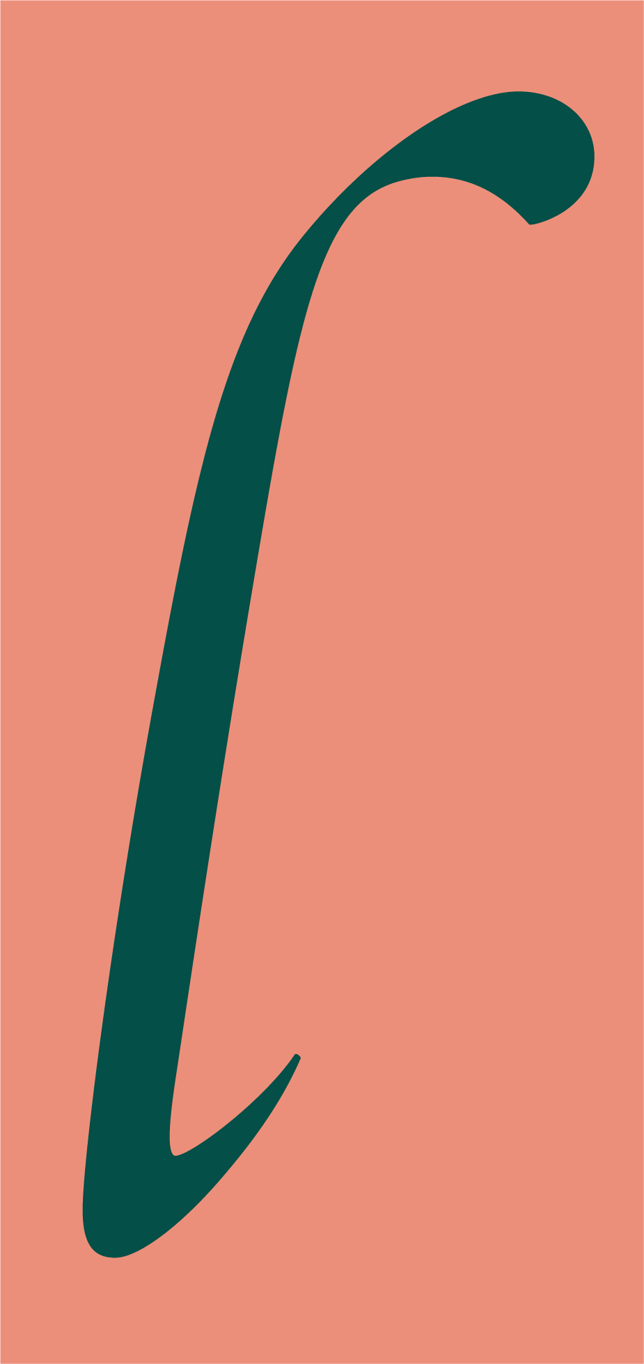
The chancery italic style captured by our Requiem typeface includes alternate constructions for ascenders and descenders, including this looping form of lowercase L from the font’s Fine Italic style.

Not to be confused with the Indian rupee symbol, the Pakistani symbol for the rupee uses this Rs digraph. This compact form comes from the Bold Italic style of the fixed-width Operator Mono ScreenSmart, a typeface designed for use on screen.
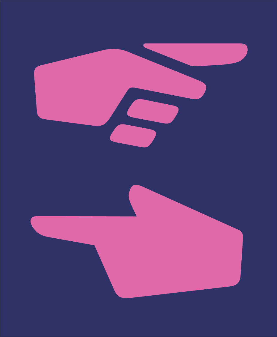
‘Manicules,’ more commonly known as fists, are among my favorite typographic accessories, making a regular appearance in fonts by H&Co. I designed these two for our Sagittarius typeface, echoing the font’s industrial science fiction aesthetic.
|
|
Thanks for taking an interest in the work we do at Hoefler&Co — I appreciate the opportunity to communicate with anyone who shares our love of typography. You’ve received this email because our records show that you signed up for our mailing list at typography.com: you can unsubscribe if you’re no longer interested, and resubscribe if ever you change your mind. As described in our privacy policy, H&Co does not buy, sell, exchange, or rent email addresses. Additional information regarding any promotions or discounts included in this email may be found in our Site Terms. Copyright © 2021 Hoefler&Co, 611 Broadway, New York, NY 10012-2608. The names of the H&Co typefaces featured herein are trademarks of Hoefler&Co, which may be registered in certain jurisdictions. All rights reserved.
|
|