With a wide range of styles, and versions specially designed for print, web, and office, Ideal Sans is a quiet but effective workhorse — and a solid companion to display serifs, informal faces, and the right condensed sans. Here’s a look inside.
Ideal Sans pairs beautifully with Chronicle Hairline, a typeface that shares its alert posture, taut lines, and welcoming character. These delicate styles are recommended for the very largest sizes: for text, use Ideal Sans’ heavier weights, and Chronicle’s Deck or Text styles.
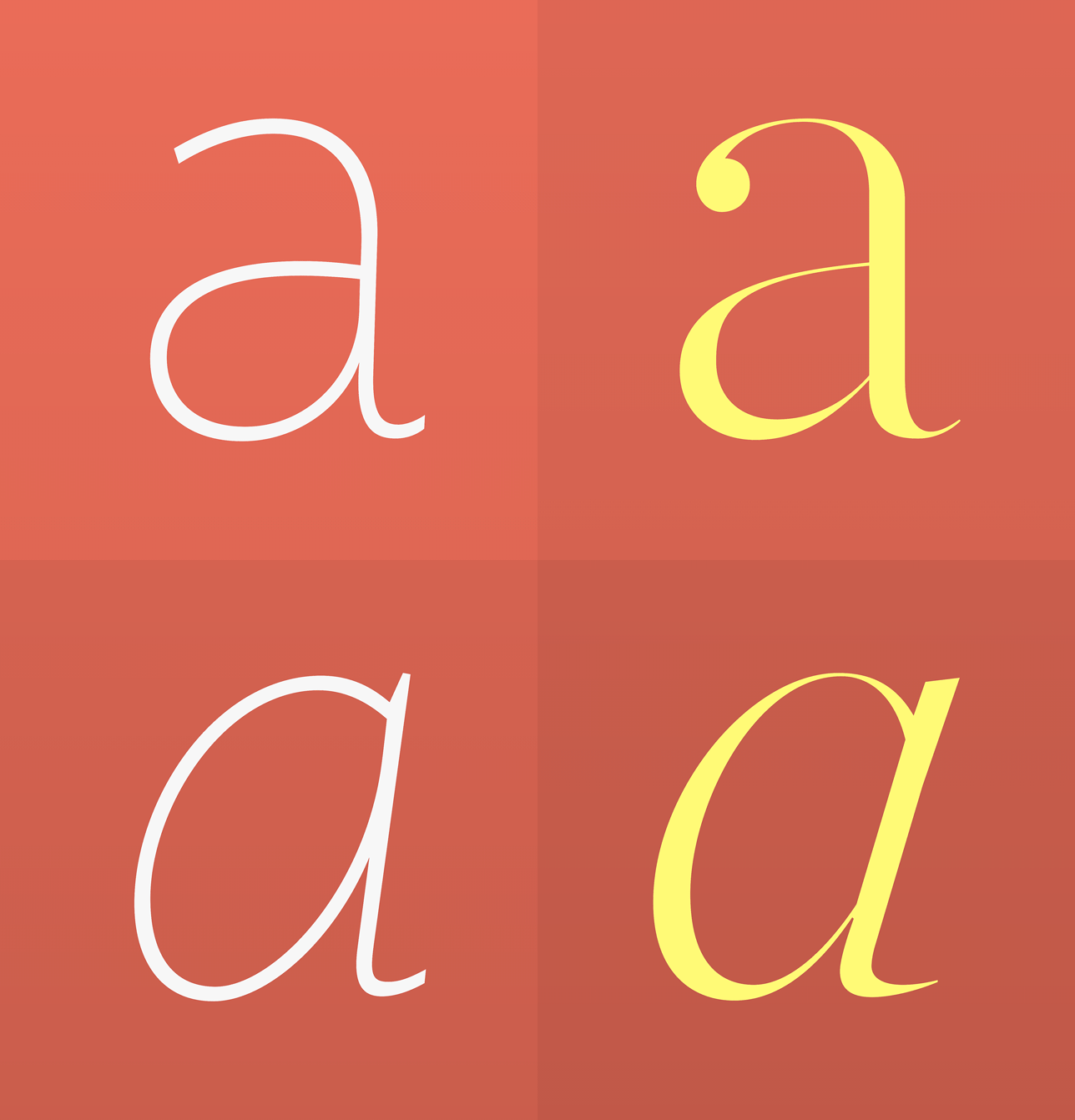
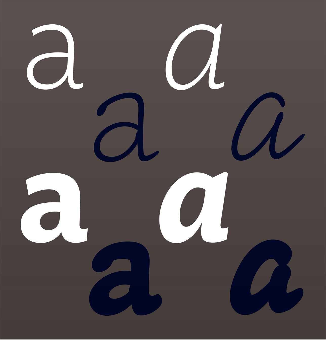
The cursive mannerisms at play in Ideal Sans are expressed even more fully in Inkwell, a new superfamily of typefaces based on different handwritten forms. Inkwell’s Serif creates an engaging counterpoint to Ideal Sans’ romans; its italics are contrasted with Inkwell Script.
To contrast the square proportions and expressive lines of Ideal Sans, try contrasting it with the new Peristyle family. Peristyle’s vertical silhouette, strict geometries, and earnest demeanor help amplify Ideal Sans’ handmade shapes and cheerful personality.