View in a browser
Hoefler & Co. Hoefler & Co.

Some of the best conversations about typography never get shared with designers. I’d like to change this.

Typeface design has a lot of discarded bycatch: small discoveries and observations that aren’t large enough to develop, but are nonetheless interesting and useful. Instead of allowing these ideas to perish, I’d like to preserve and share them, with the hope that they’ll be helpful, diverting, or inspiring to other designers. Watch this space.

Which one’s balanced? Comparing horizontal lines. Which one’s balanced?
 

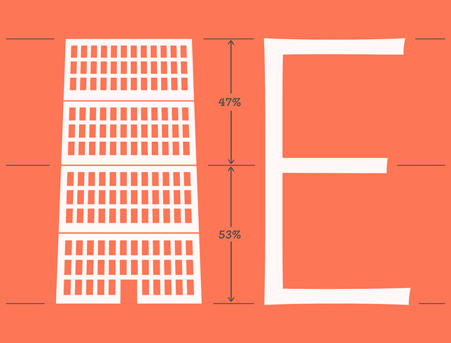
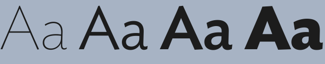
This month, researchers made official something that typeface designers have long known: that horizontal lines appear thicker than vertical ones. At left, a square made from equally thick strokes; at right, the one that feels equally weighted, its vertical strokes nearly 7% thicker than the horizontals. This phenomenon, central to typeface design, has implications for the design of logos, interfaces, diagrams, and wayfinding systems, indeed anywhere a reader is likely to encounter a box, an arrow, or a line.

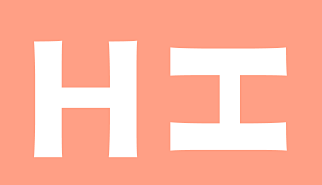
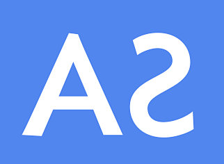
Published in the journal Vision, this peer-reviewed paper confirms that most people overestimate the thickness of horizontal lines. This is the very optical illusion for which type designers compensate by lightening the crossbar of a sans serif H, an adjustment that’s easily revealed by looking at a letter sideways. When rotated, the evenly-weighted Gotham is revealed to have thicker verticals than horizontals; try the same in Ideal Sans, a typeface designed to push against the boundaries of what we normally notice when we read, and it becomes clear how little we actually see of what is there.

Gotham
Ideal Sans
 

This new study by de Waard, Van der Burg, and Olivers explores different theories as to why we see these things the way we do. Cultural forces presumably play some part: Western typeface designers have long been taught that our bias about weight and directionality stems from the role of the broad-edged pen in European calligraphy, which still underpins our expectations about what letters should look like. (Even the most monolinear letter A has a thin side and a thick, an enduring vestige of calligraphic patterns.) Intriguingly, the divergent traditions of Arabic and Latin calligraphy have a detectable influence on perception, for which the authors offer some interesting statistics.

 
Ideal Sans


But they go further, to offer some compelling physiological explanations for the phenomenon. One possibility, proposed in an article from the Journal of Experimental Psychology cited by the authors, suggests that our field of vision — more horizontal than vertical — has an effect on the relative perception of size. Also mentioned is a 2002 article by Catherine Q. Howe and Dale Purves, published in the Proceedings of the National Academy of Science, which hints at a larger explanation for all optical illusions, a theory to which I’ve long subscribed but never seen argued: that, because our brains evolved to reckon with the three-dimensional world, the expectations that bring to bear upon two-dimensional forms often don’t apply. When there’s a disconnect between what we see and what we expect to see, we experience this as an optical illusion.

 
Ideal Sans
 

Is it possible that all of typography’s many optical illusions can be correlated with misapplied learning from our experience of the real world? So much of perception involves reflexively adjusting for the effects of context, light, or perspective, in order to make quick judgments about size, distance, color, or mass. Do we perceive round letters as shorter than flat ones because we intuitively understand something about the weight of cubes and spheres? Is it a lifetime of looking at foreshortened things above us that leads us to expect a well-balanced letterform to be smaller on top than on the bottom? These are half-thoughts that I’d love to see explored by further research. In the meantime, it’s a good reminder to design not for what we expect to see, but for what we actually believe we’re seeing.

Jonathan Hoefler
16 January 2019


Typefaces Mentioned

Gotham typeface

Gotham

 
Gotham typeface

Ideal Sans


Thanks for taking an interest in the work we do at Hoefler&Co — I appreciate the opportunity to communicate with anyone who shares our love of typography. You’ve received this email because our records show that you signed up for our mailing list at typography.com: you can unsubscribe if you’re no longer interested, or resubscribe if you change your mind. As described in our privacy policy, H&Co does not buy, sell, exchange, or rent email addresses. Copyright © 2019 Hoefler&Co., 611 Broadway, New York, NY 10012-2608. The names of the H&Co typefaces featured herein are trademarks of H&Co, which may be registered in certain jurisdictions. All rights reserved.

Recently from H&Co: A sans with warmth and humanity